Business Advantages of Responsive Web Design
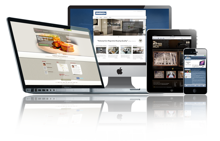
Responsive design is a web design and development technique that creates a site or system that reacts to the size of a user’s screen. Responsive design will optimise a user’s browsing experience by creating a flexible and responsive web page, optimised for the device that is accessing it.
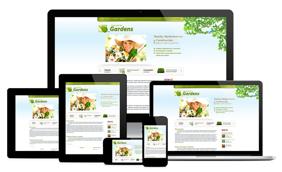
With the rapid increase in the use of smartphones to access the internet, have you given a thought to your website being accessible to those masses that are more comfortable in browsing the net on their smartphones? Yes, just like the number of mobile users is increasing every day, the number of people who use their mobile phones to quickly check a service provider or quickly read a review is also increasing. It is important that you have a good presence in the internet and in addition to this you must also consider the different strata of internet users. At Scriptonova, we assure you that all you have to worry about is what material you would like to put into your website and you can leave the rest upon us. We are an expert in designing your website to be accessible for the smart phone users.
How can we help you develop your business?
If you are looking forward to your presence being felt everywhere then this is a good way to proceed with it. Mobile site development helps your website become befitting for those users of the internet who access the net through their mobile phones. If you have tried accessing a certain website that is not developed for the cell phone, you may have noticed how difficult it is to get information using your phone and how time consuming it can get. Today, the number of smart phone users has increased a great deal and you cannot afford to stay behind competition when others are getting ahead with making their product available in any kind of media. With our help at Scriptonova, you will also be able to reach out to the vast number of smart phone users.
- More brand appeal: This is completely from a competitive point of view. Brands that adapt to new technology are more acceptable to consumers. Our team of experts will give your website the cutting-edge that is may be lacking now. You never know, if your competition has not yet moved to mobile technology, their consumers could soon become yours.
- Befitting website only for the mobile users: You have to agree that regular webcontent that you are used to viewing on your computers or laptops are not fit to be viewed on the screens of your phone. If a consumer is trying to find one of your products on his phone and misses it because your website is not fit to be used on a smart phone, you will run the risk of losing a potential customer. If your web page is not compatible for mobile phones, your consumer might have to zoom in and maybe lose interest to go further into your website because of this inconvenience. This is why we will help you with your Responsive site development so that you do not lose any potential customers.
- Faster access: With a fast and appropriate access, you can rest assured that your consumer will not venture out to another website if all that they need is made available on your website. In case you think Responsive site development is unnecessary, you may have to think again when you see potential customers move to another website because of a slow loading time. Let us help you retain your customers and you can do what you are best at – give your customers what they need.
- More connected experience: With a Responsive website you can keep your users connected to your website more easily than in any other case. We will help you do that by implementing a ‘click-to-call’ and a quick connection to Google Map features. This will give your users easy access and they can even Contact you easily to gather more information about your products.
Increasing your reach to tablet and mobile audiences

Increasing use of the internet and proliferation of web applications on tablet and mobile devices has been the driving force behind this development. Traditionally users would be re-directed to a device specific site (e.g. mobile), but responsive design means one site can be implemented across devices.
Tablet sales are expected to exceed 100 million this year, meaning that responsive design has never been so important for those looking to optimise their online content. Indeed, some Byte9 sites are already experiencing up to 40% traffic from tablet and mobile devices, a strong commercial imperative to accommodate the smaller screen size in a unified design.
Increase sales and conversion rates
Another benefit of responsive design is that the user has an improved site experience as there is no need for redirection, use of standardised Style Sheets (CSS) across devices and unified design approach will also create a consistent look and feel. Consistent user experience will have a positive impact on your conversion rates as people are familiar with navigation and site or system use across devices. Responsive design removes some of the barriers that having multiple sites can present, i.e. in functionality, performance and consistent look and feel.
Consolidate your analytics and reporting
A single responsive site means that you no longer have to track user journeys, conversion paths, funnels and redirections between your sites. Site analytics tools like Google Analytics are now optimised to handle multiple devices and responsive reporting. All of your tracking and analytics will continue to function and be condensed into a single report, allowing for easier monitoring and analysis.
Increase your visibility in search engines
Responsive Design means you can manage one website with a single set of hypertext links; therefore reducing the time spent maintaining your site. This allows you to focus on link outreach with a consolidated Search Engine Optimisation (SEO) strategy. SEO campaigns can be time consuming and costly, but by creating a responsive site, all of your efforts can be focussed on a single site, with unified strategy and tactics across devices.
Content is vital in SEO, good quality content which is regularly released improves your search engine ranking page positioning, therefore a further advantage of responsive design is that fewer resources can be wasted in low-level duplication of content across sites, the content need only be applied to a single site, increasing your chances or a higher search engine ranking.
Additionally Google suggest (which Byte9 analytics can confirm) that mobile optimised, responsive sites are featuring prominently in localised search results. This is obviously of huge significance to high street and online retailers, amongst other burgeoning mobile use cases.
Save time and cost on mobile development
A primary benefit of adopting a responsive design is that it takes less time than creating an additional stand-alone mobile site, which has been the traditional approach. Testing across a number of websites also increases your development, support and maintenance overhead. As styles are re-used and optimised by device standardised testing methodologies can also be used.
Save time and cost on site management
Clients will also find it much easier and less time consuming to manage and maintain a single site, with much less content to manage. Additionally a single administrative interface can easily be optimised, using layout and workflow tools to manage the correct content, or site templates that are being used for different devices. Business logic can be applied such that the overall multi-device experience can be significantly enhanced within a single administration, like Blaze CMS.
Enhance user's offline browsing experience
Responsive design allows site owners to deliver quality content to audiences across devices, the offline browsing capabilities of HTML5 mean that sites can be easily accessed ‘on the go’. As HTML5 enabled tablets and smart phones proliferate this will become increasingly important. Email newsletters, and content contained in hybrid HTML5 web applications will increasingly be consumed on the move and in the absence of an internet connection.
Responsive design allows you to stay ahead of the trend. As the demand for media rich mobile internet and apps is burgeoning, several important implications must be addressed; development and maintenance costs, visibility in search engines and better conversion rates.